


Introducing Alias, my debut typeface. First released in one weight, Min, now updated with its ultra-contrasted counterpart, Max.
I’m issuing Alias under a free license, to use wherever and whenever you’d like. Download FS Alias.
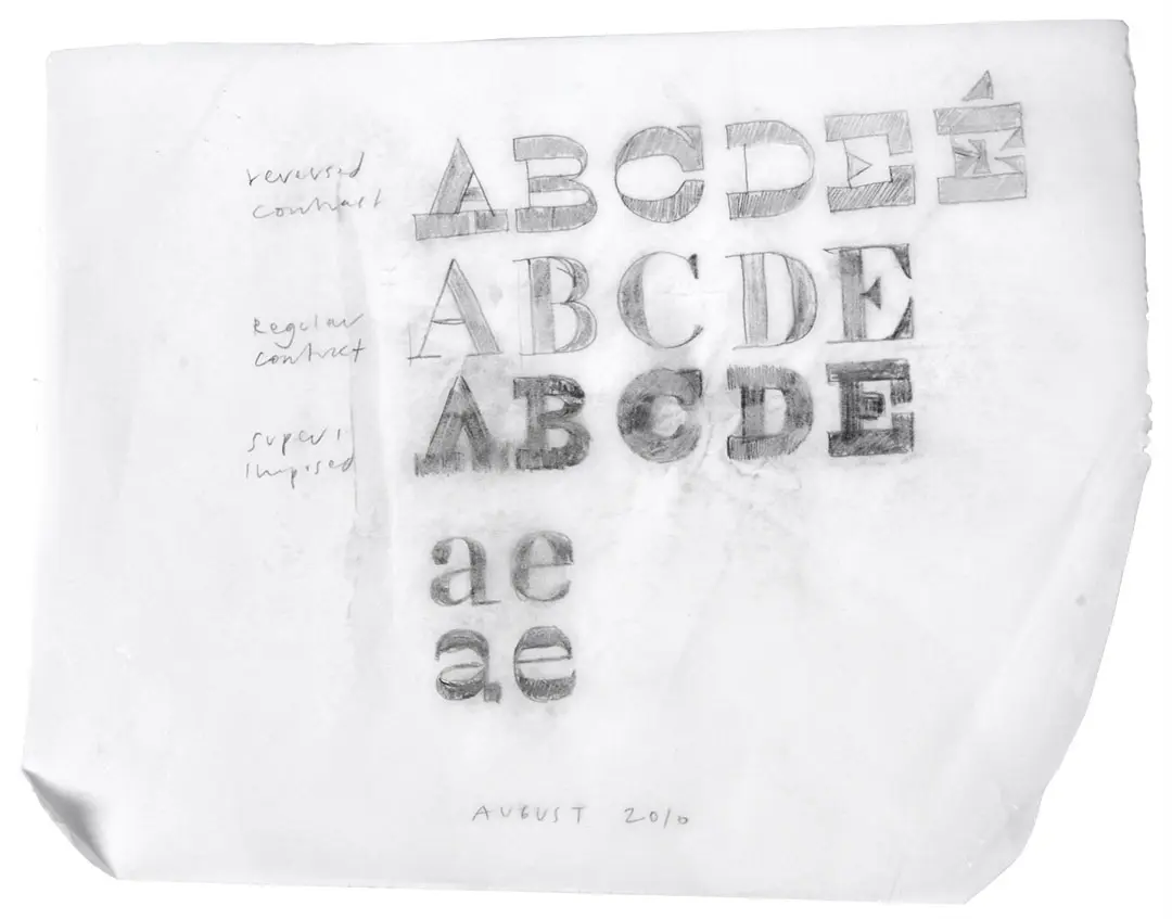
Alias is built entirely on reverse contrast, inspired by Peter Bil’ak’s project, , which plays between the lines of ‘Beauty and Ugliness in Type Design’. The project began in Hamburg, during the semester-long course, New Page. Taught by Pierre Pané-Farré and Simon Thiefes at HAW Hamburg in 2023.
Early sketches featured ink traps and heavy slabs that were printed in hatches by a . Shaped by a university learn-through-making ethos, its design isn’t perfect but I’ve tried to embrace that rather than polish it away entirely. Seen most in details like the oversized tittle, which proves itself in the Max weight. As the design developed, the Min weight was refined to perform better at smaller sizes while retaining its original reverse-contrast charm.
Alias was first used for the Kingston BA Graphic Design , presented at our internal degree show (2024).